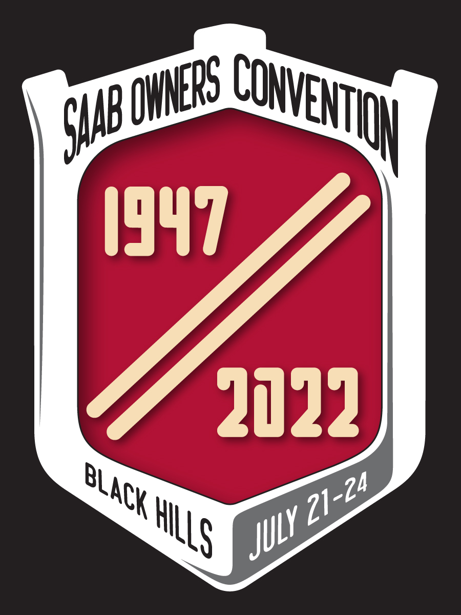
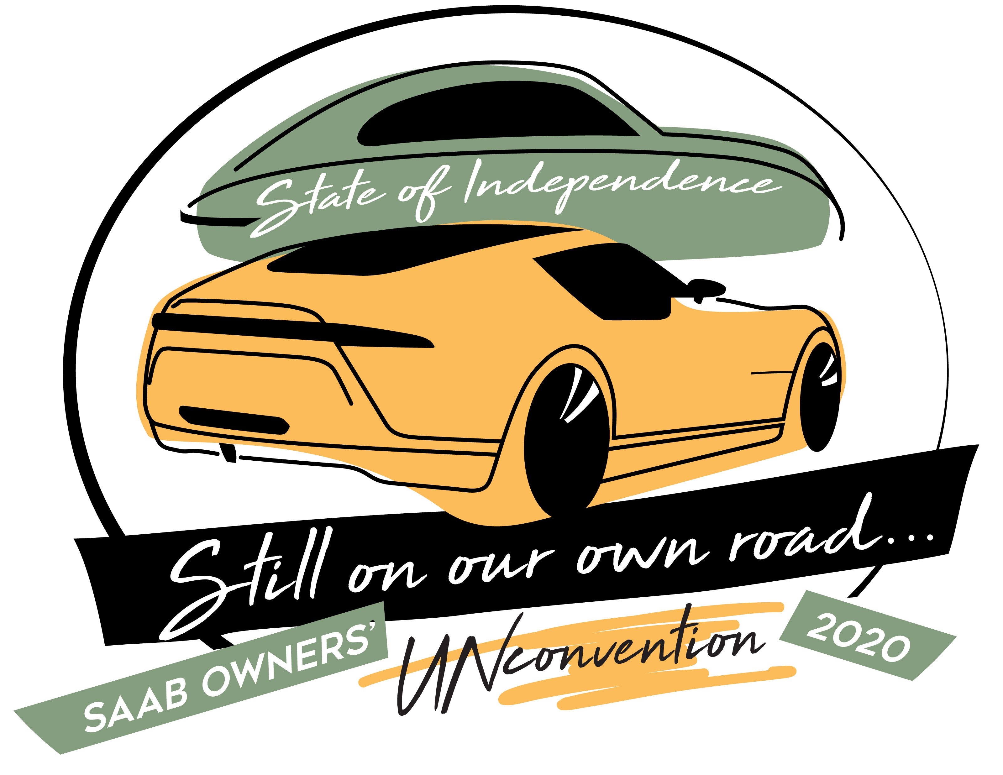
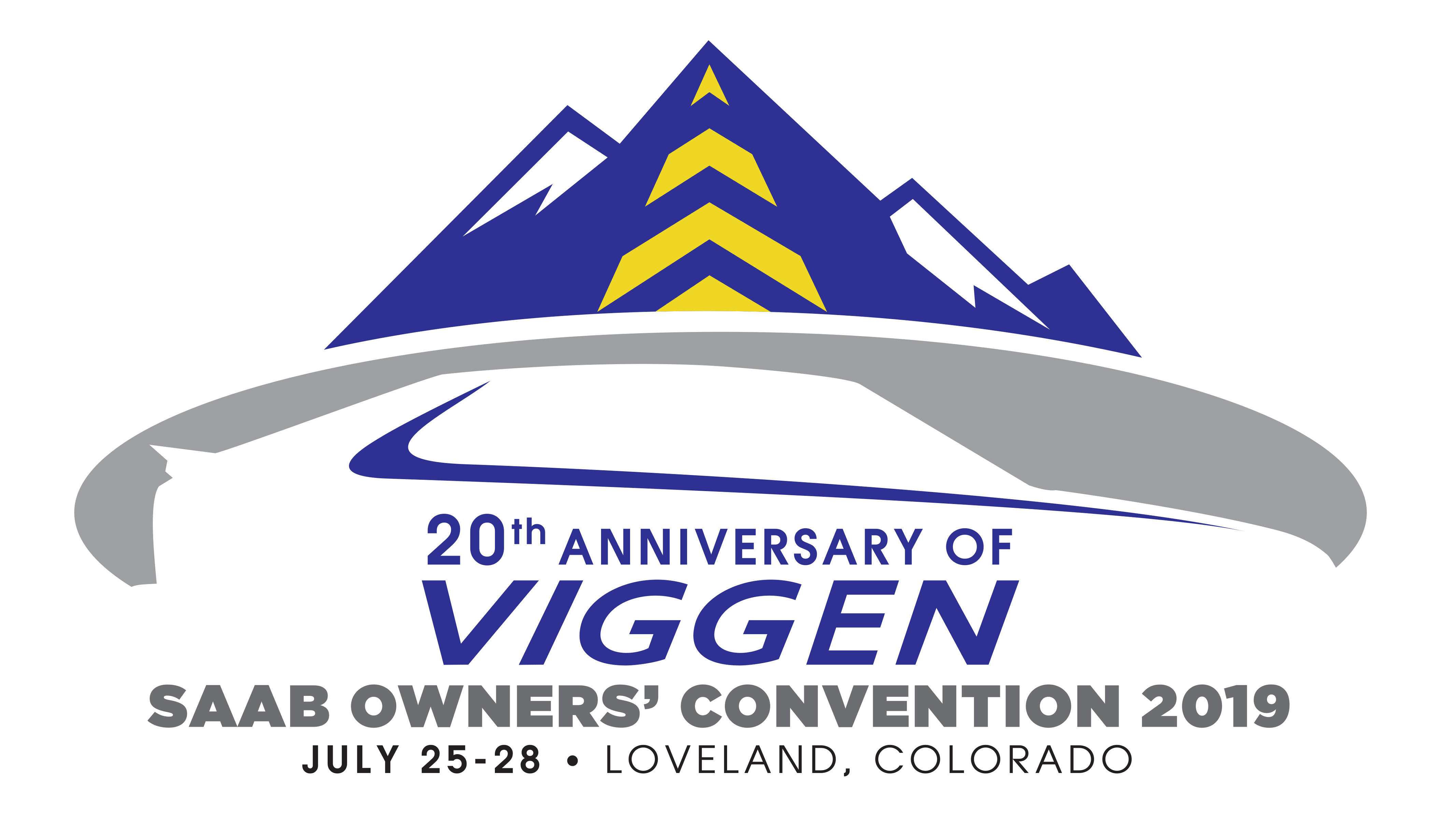
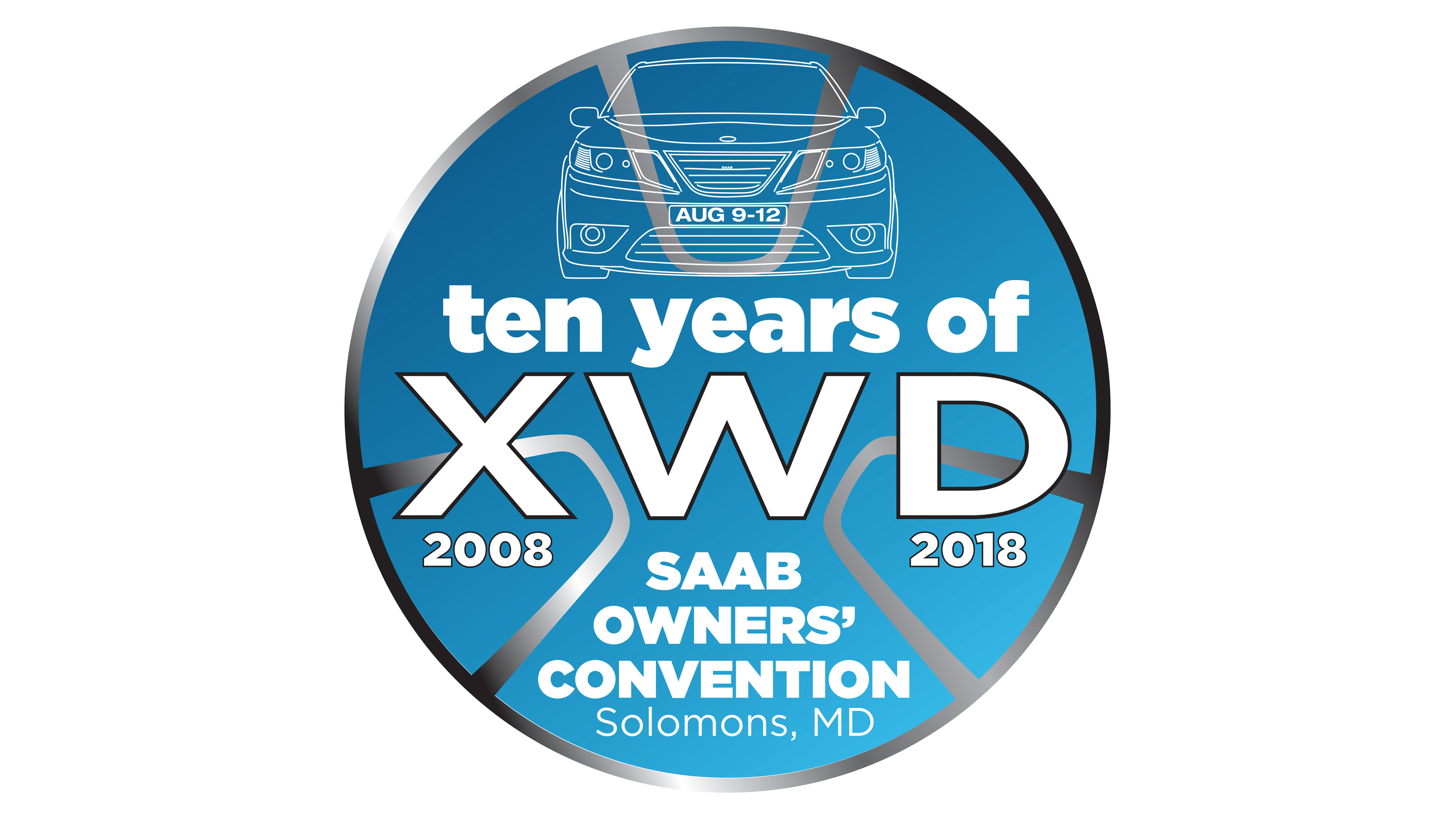
with 5 SAABs in our family (at the moment), and having had SAABs in our family since 1976 when i talked my dad into buying a SAAB 99 GLE, it’s an honor to be able to support the continuing SAAB community by not only creating logos for them, including the SAAB Club of North America logo and the SAAB Owners Conventions that are held each year, but also art directing and laying out the quartly 9s magazine.
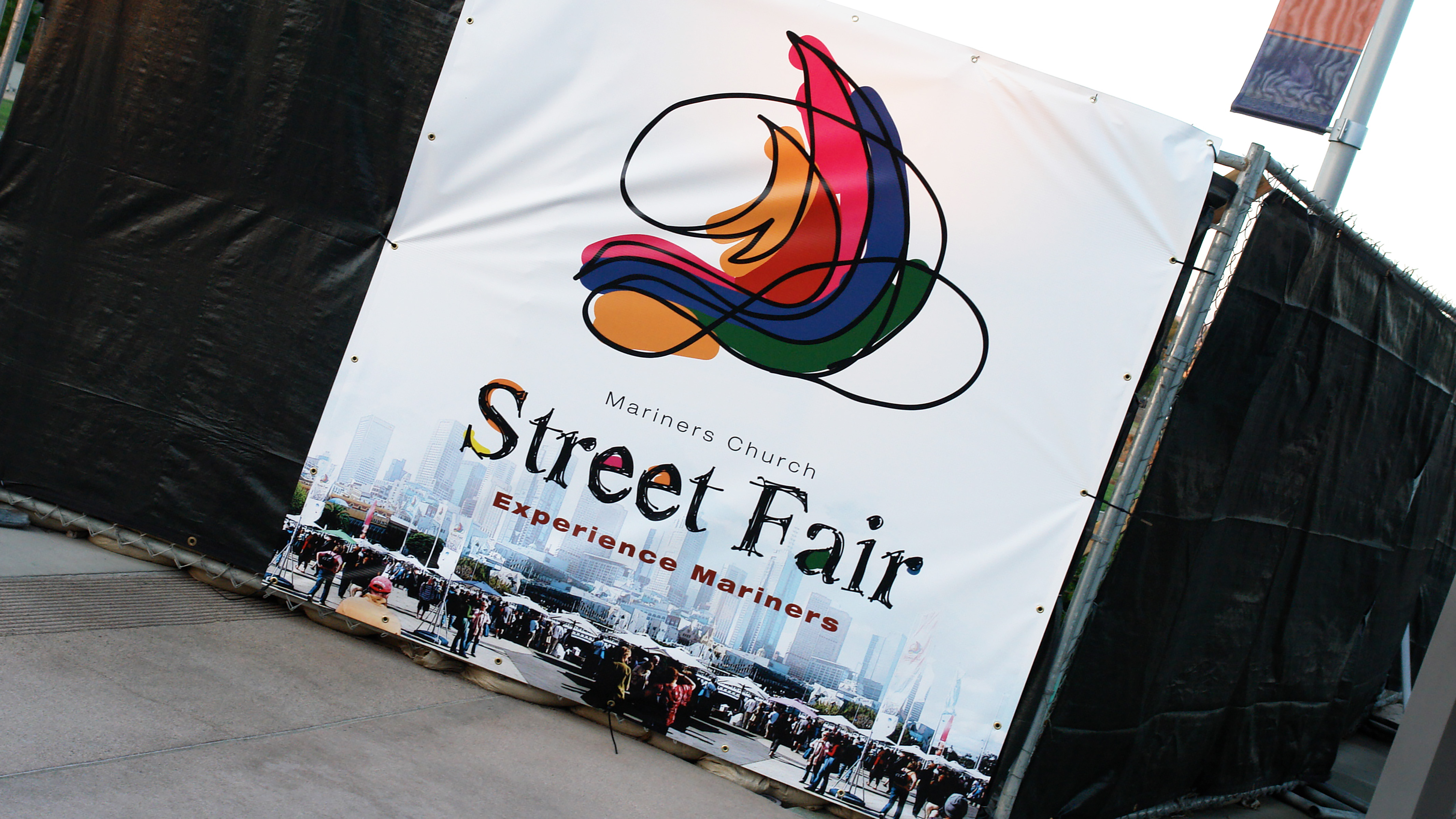
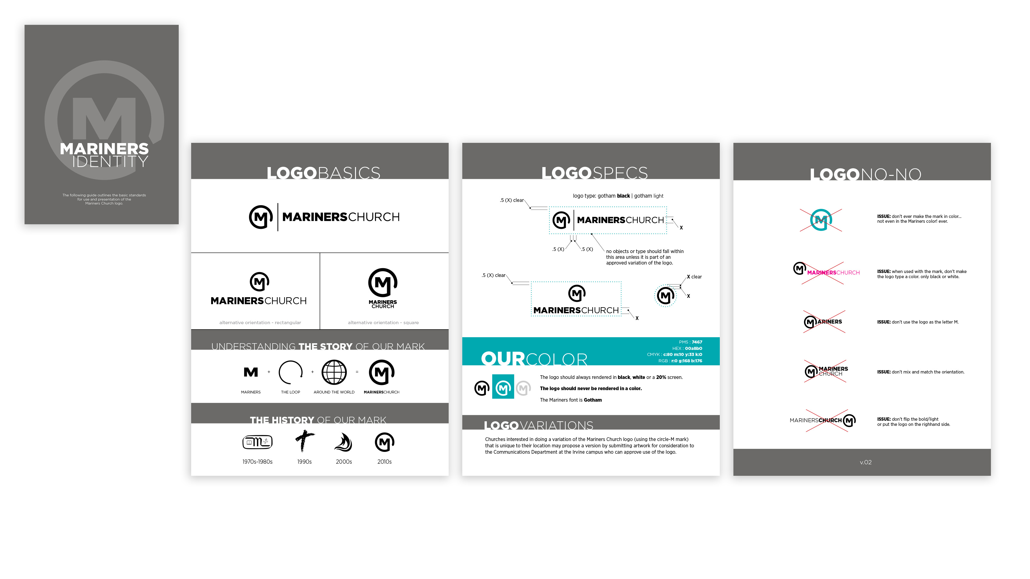
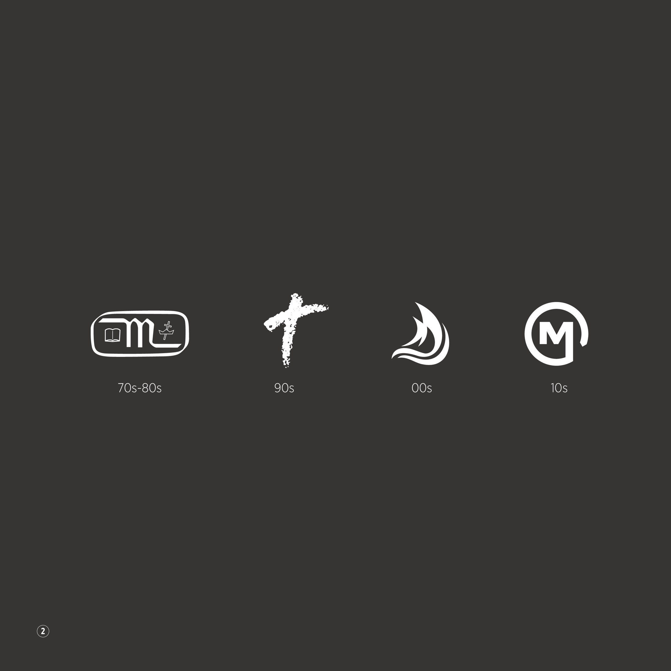
in 2013 i got the privilege and opportunity to redesign the logo for Mariners Church. i had played a role in the layout and implementation of second logo that the church used–from the early 90’s–and all of it’s iterations as we merged to become mariners south coast church in 1996 and then went back to mariners church. but due to some crazy circumstances and changes in leadership, i wasn’t involved with the redesign that was done in 2003. so being able to create a mark for a church i had been so deeply involved with was a wonderful and satisfying journey. and i could not have done it without the wisdom and design advice i received from the executive pastor at the time, brian norkaitis.
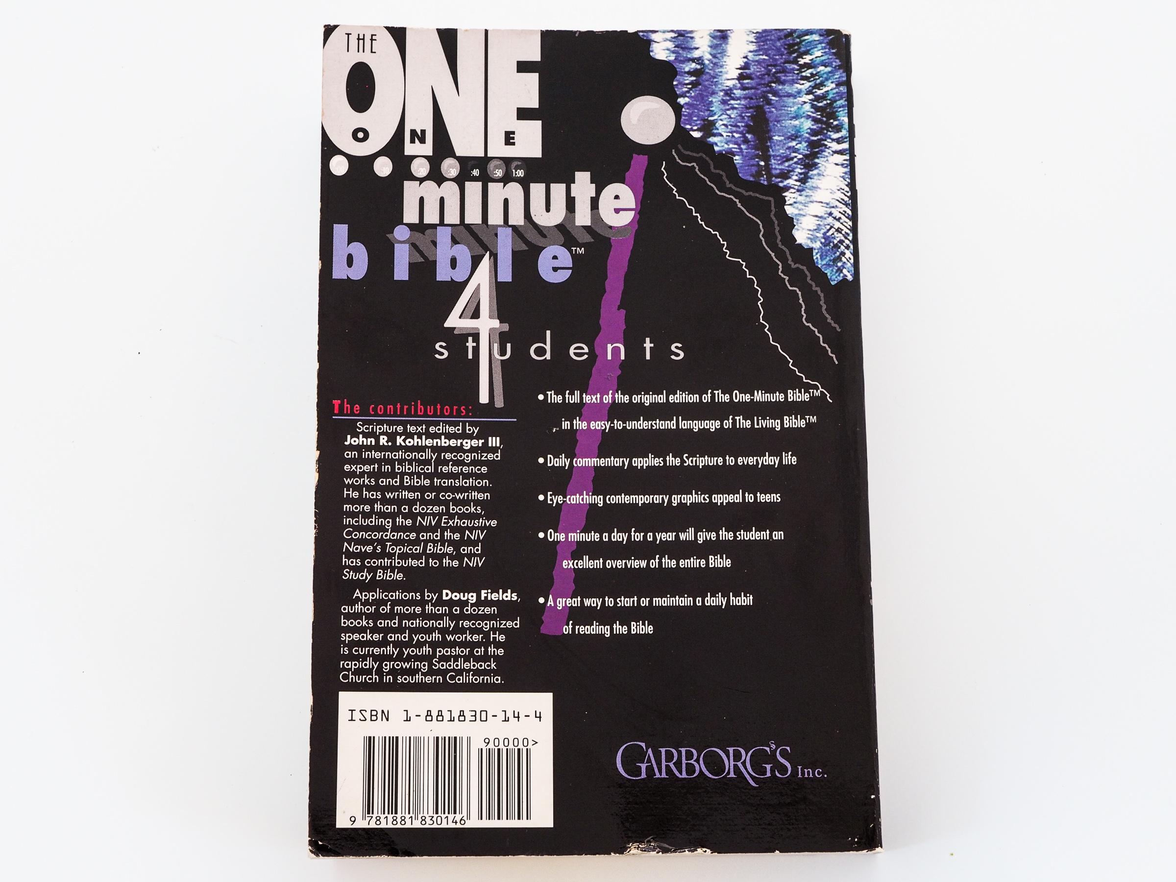
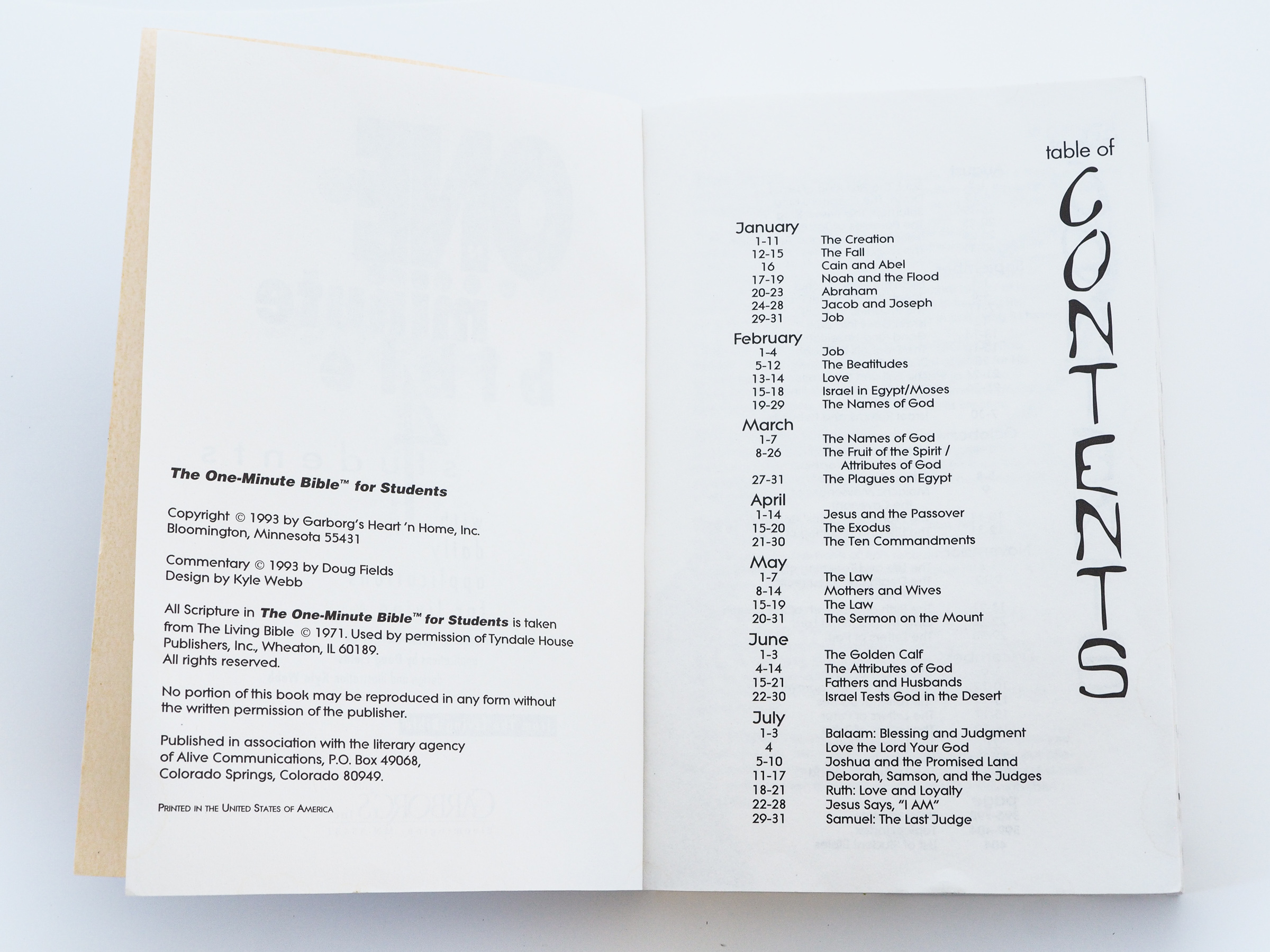
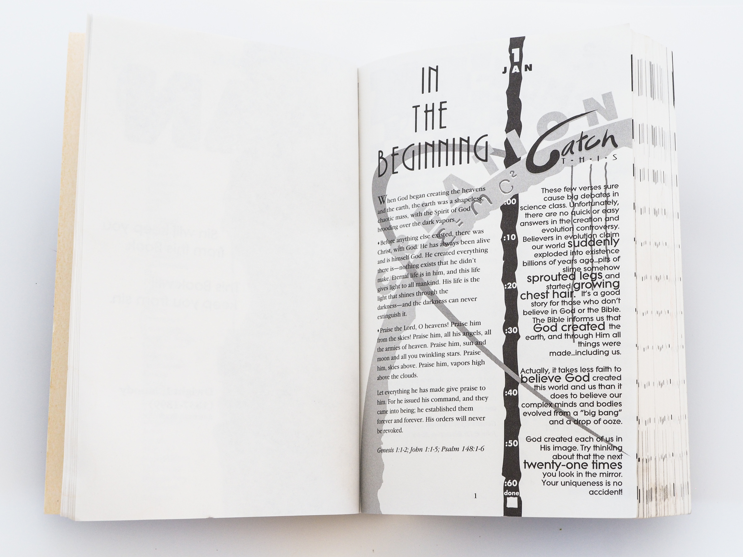
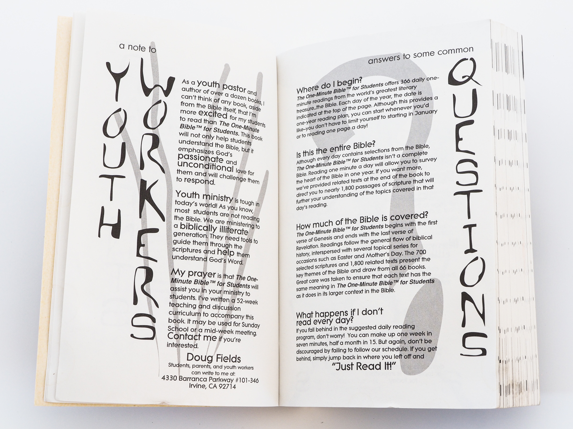
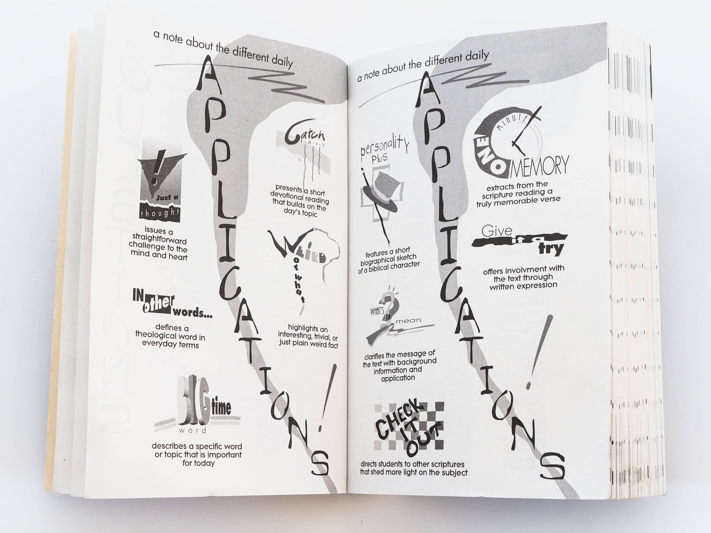
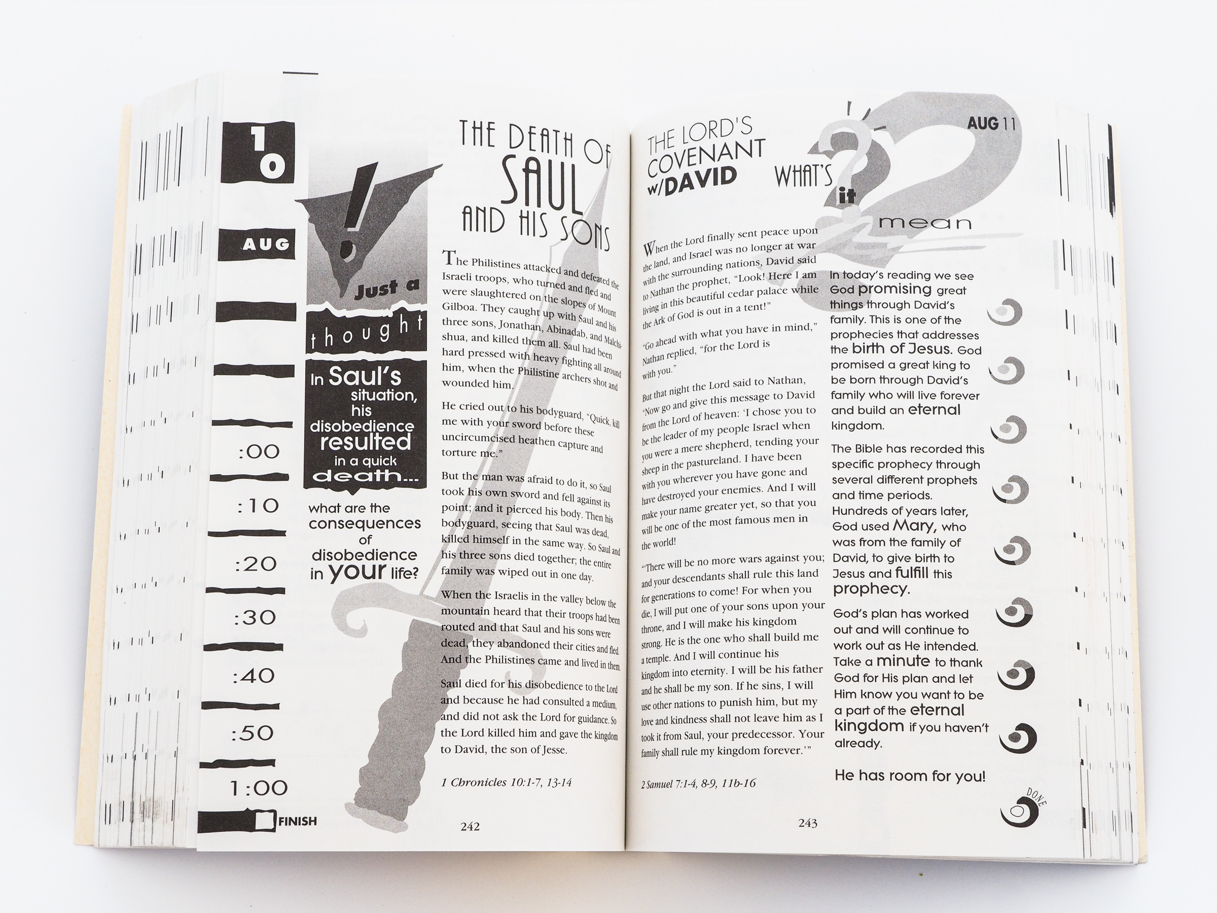
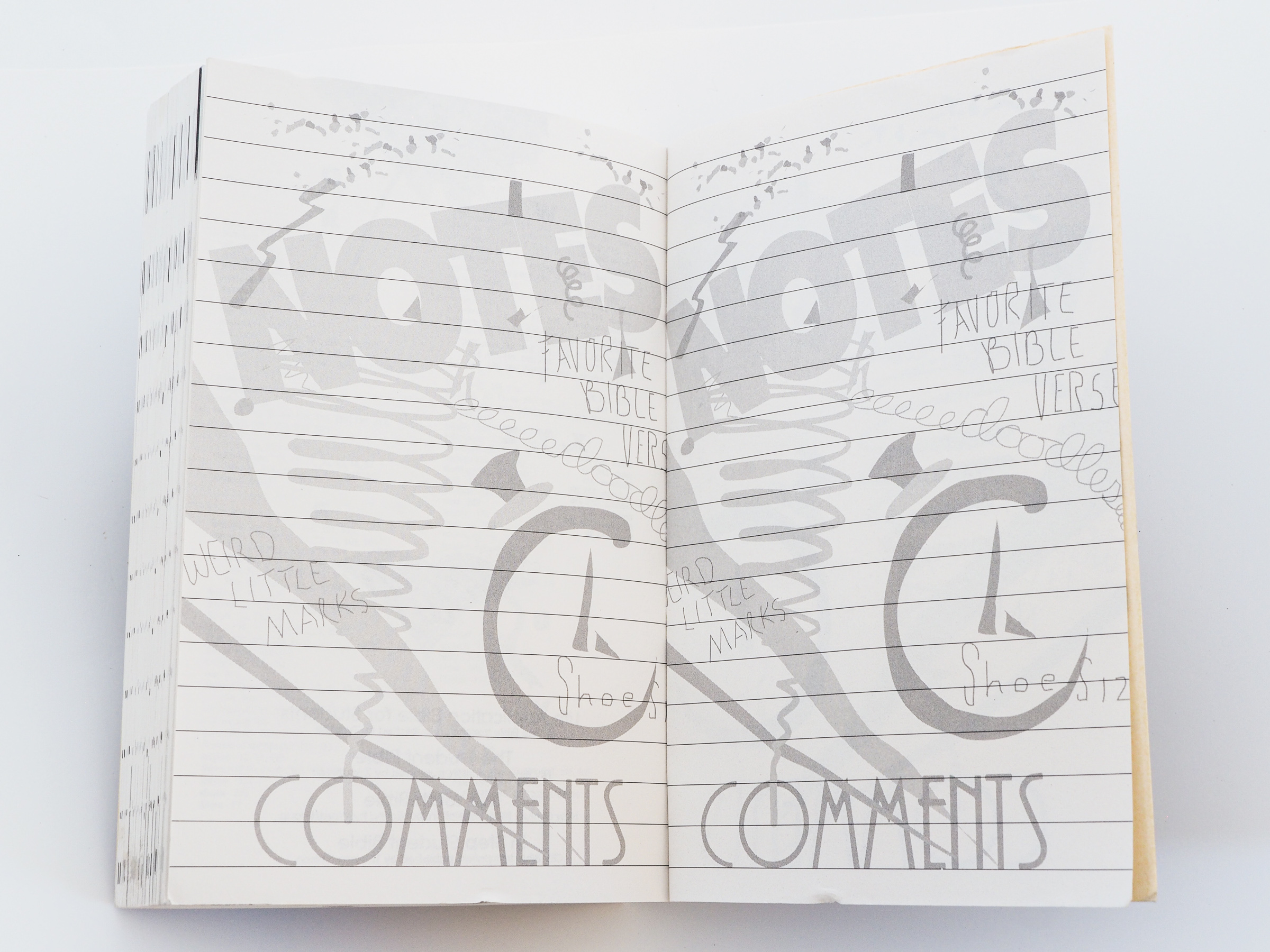
Back in the early ’90’s, a neighbor introduced me to a youth minister they knew who was looking for a designer to help with some projects. Turns out, this youth minister was Doug Fields. We worked closely on the designs for this Bible for months, meeting almost weekly in my “conference room” at Carl’s Jr. Even though I developed 10 basic templates, we looked for opportunities to do unique illustrations throughout that tied into the message for the day. In the end, I laid out every page.
I had designed several draft covers, and after a couple of high school student focus groups, Doug and I decided to ask Garborg’s to do two covers, one black and one white. this obviously is the black one. The white one was the same design, just on a black field.
Even though by today’s standards, the designs clearly feel dated, I feel honored to have had the unique opportunity to design a Bible with graphics relevant to a particular generation. This was also released in England with an Anglicized version I created. Turns out they have “chips” instead of french fries and they spell color weird.
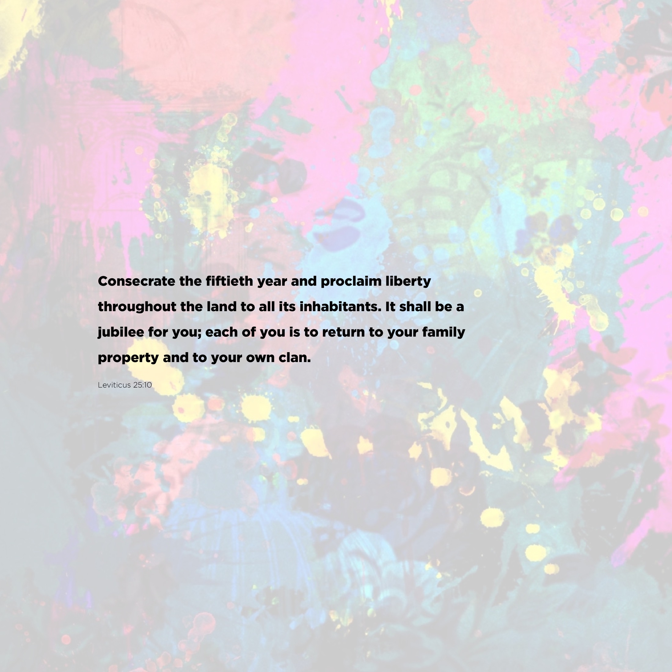
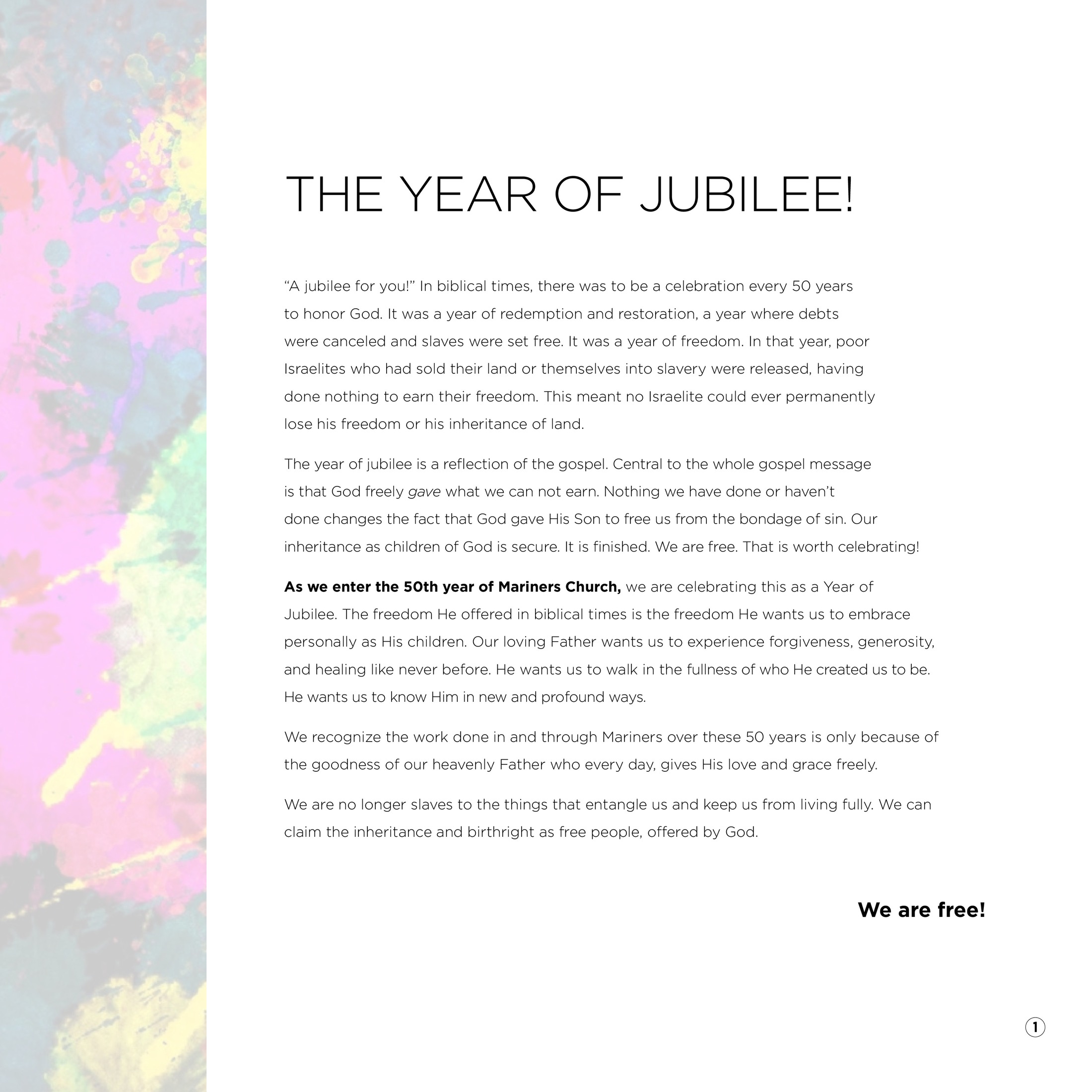
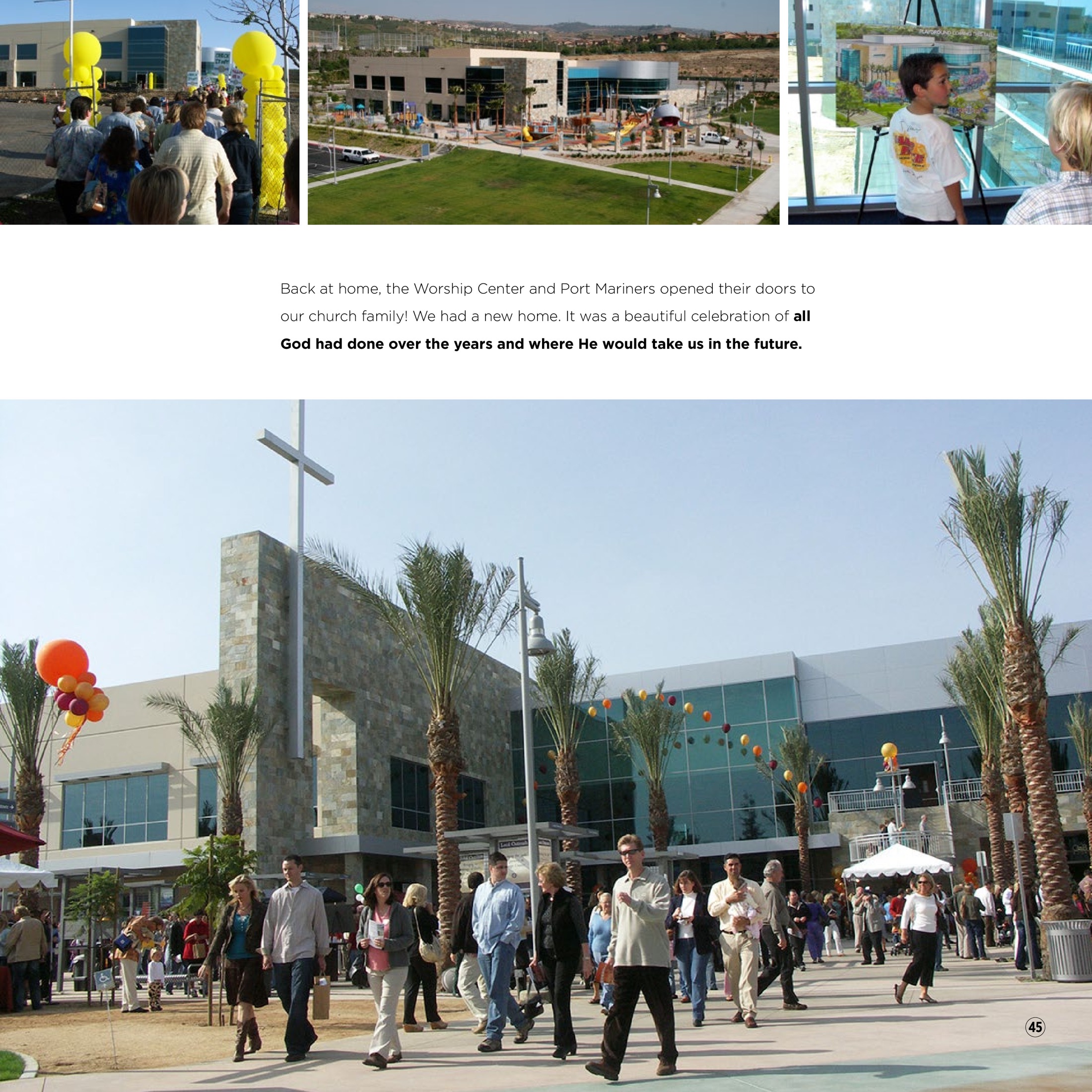
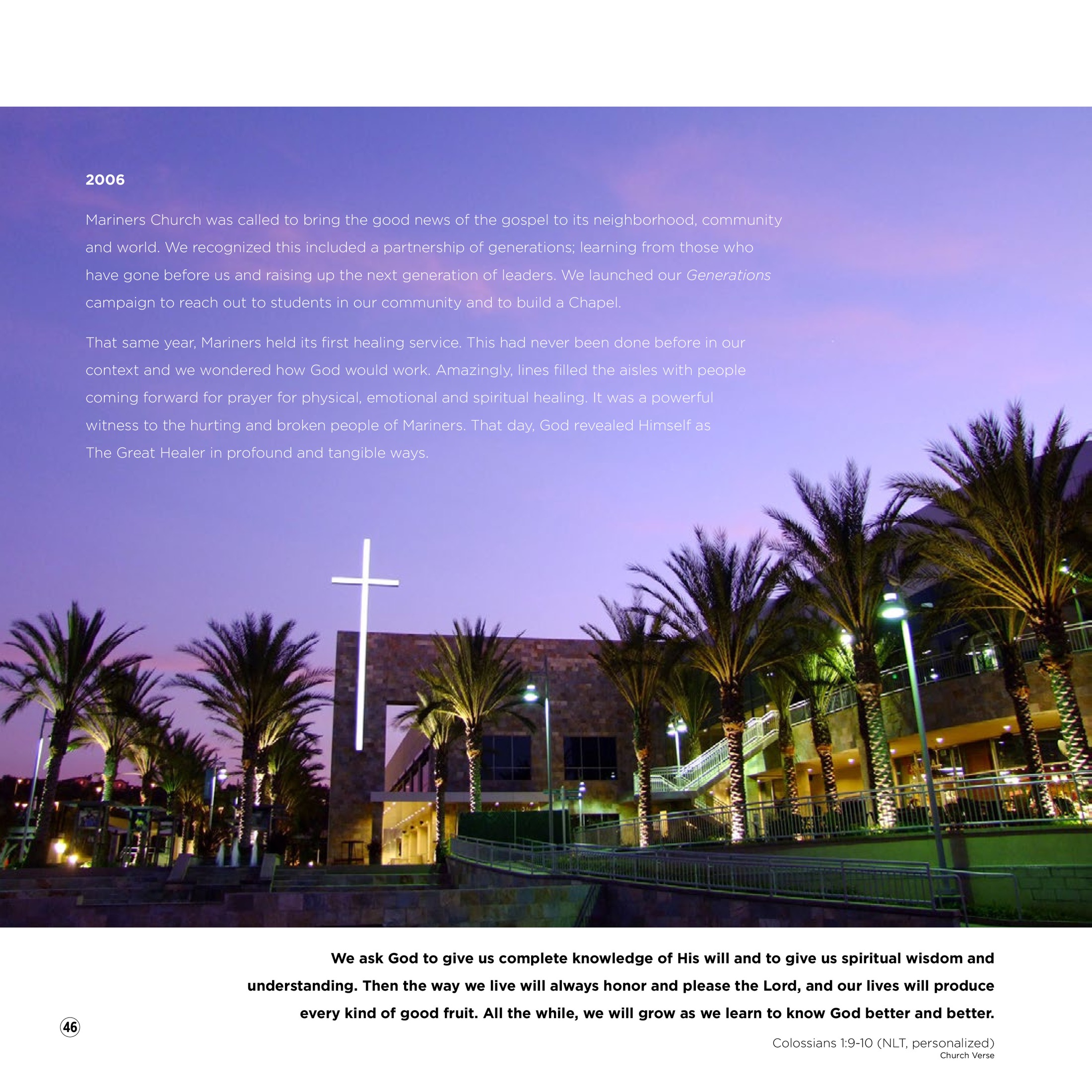
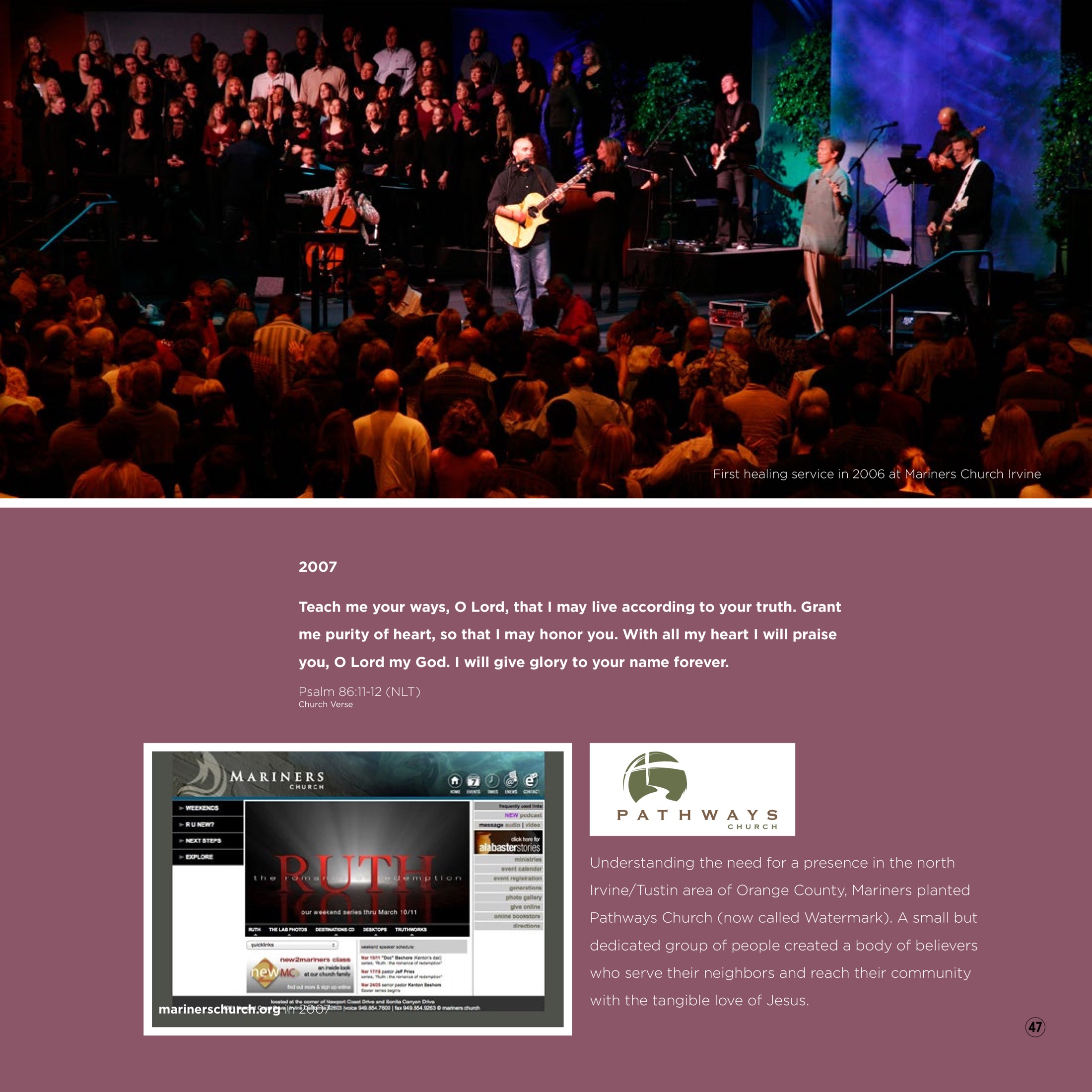
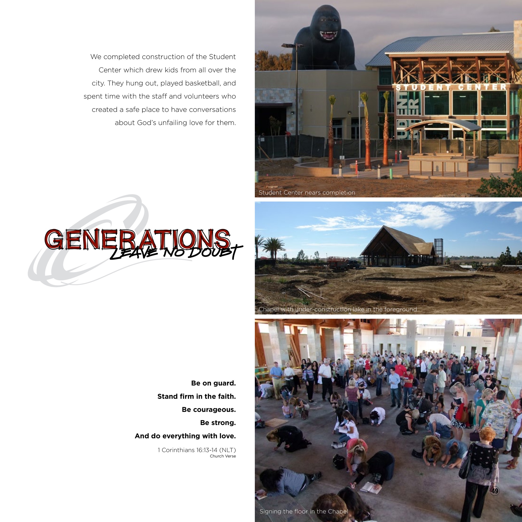
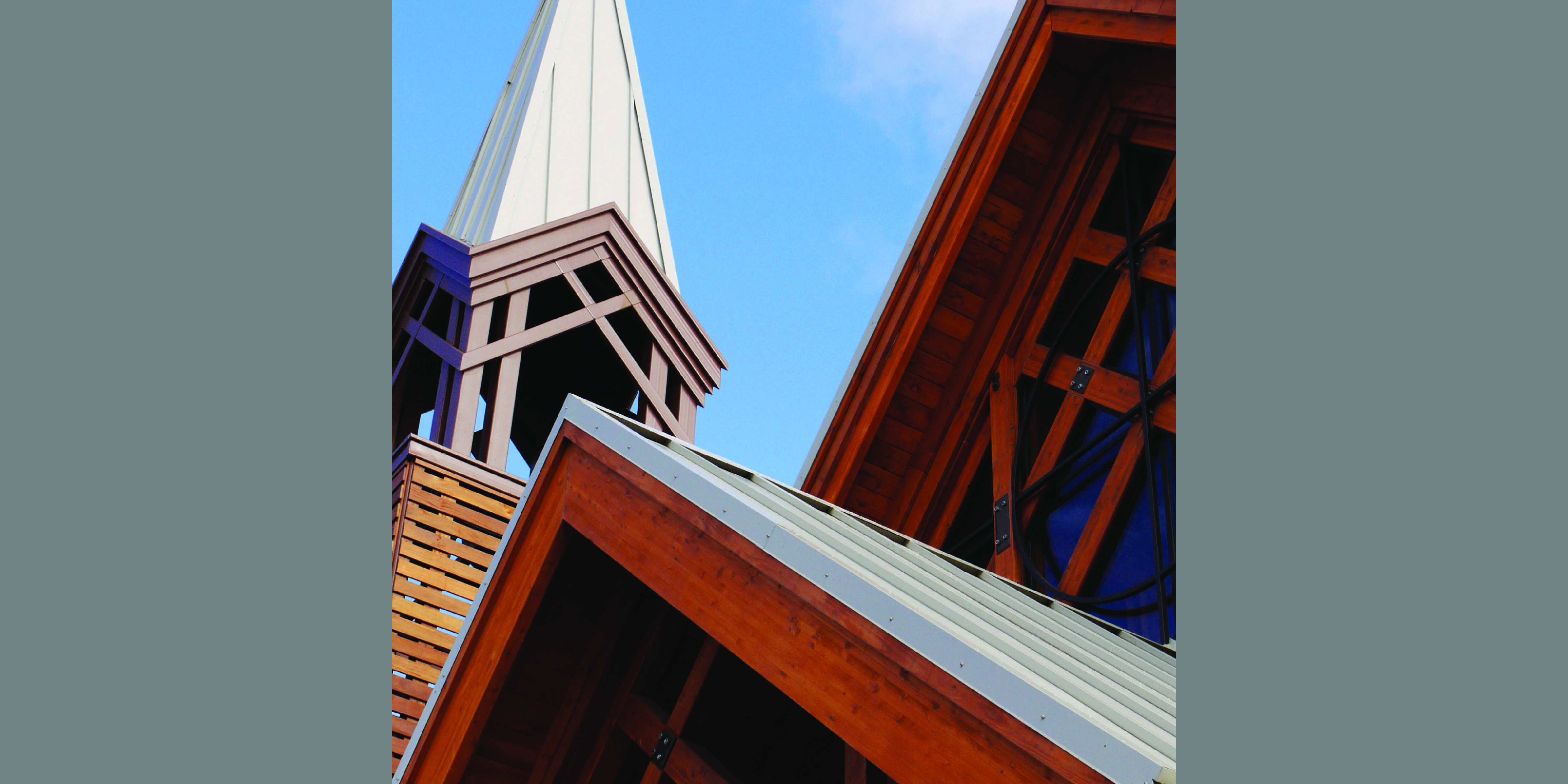
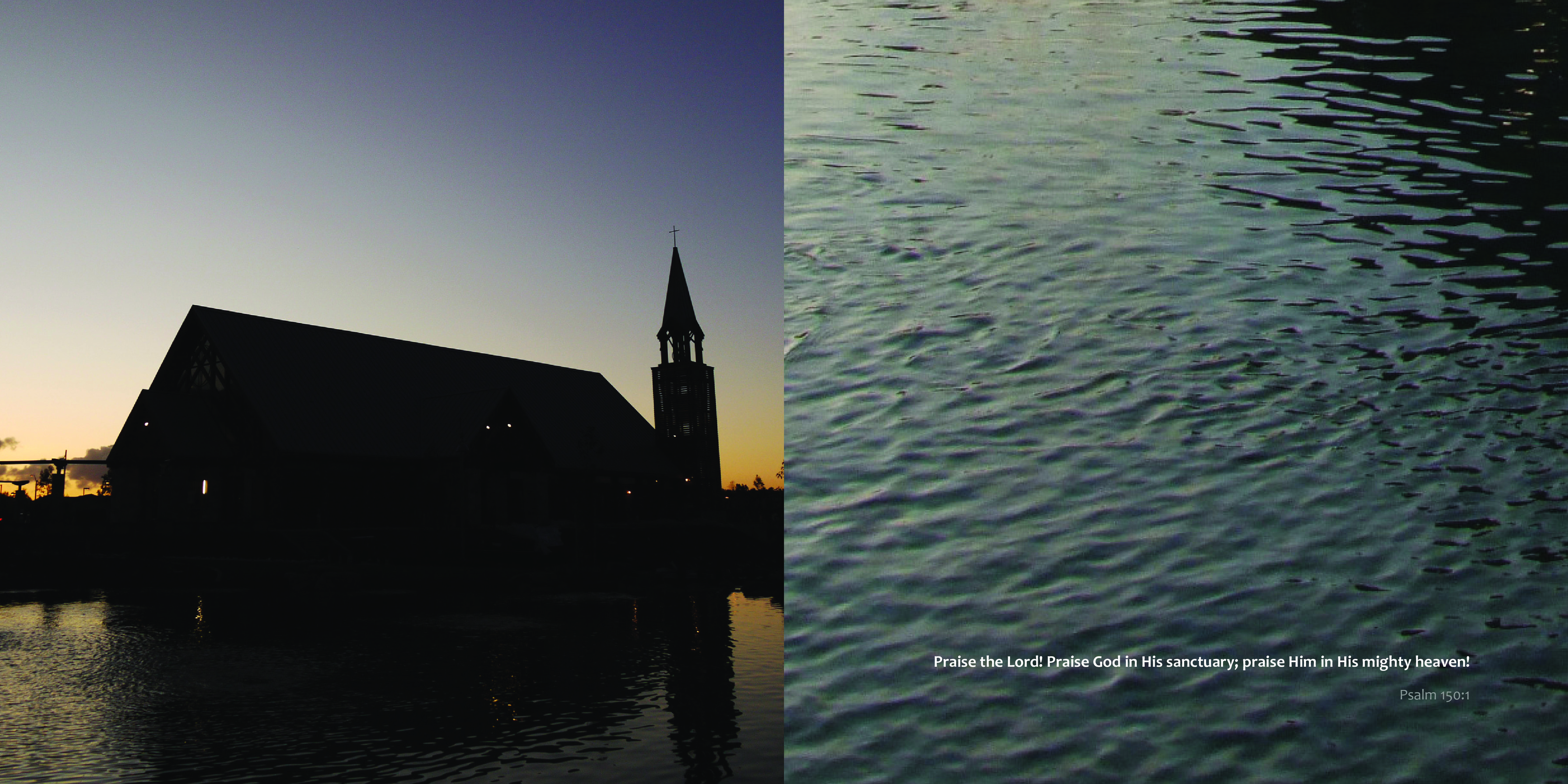
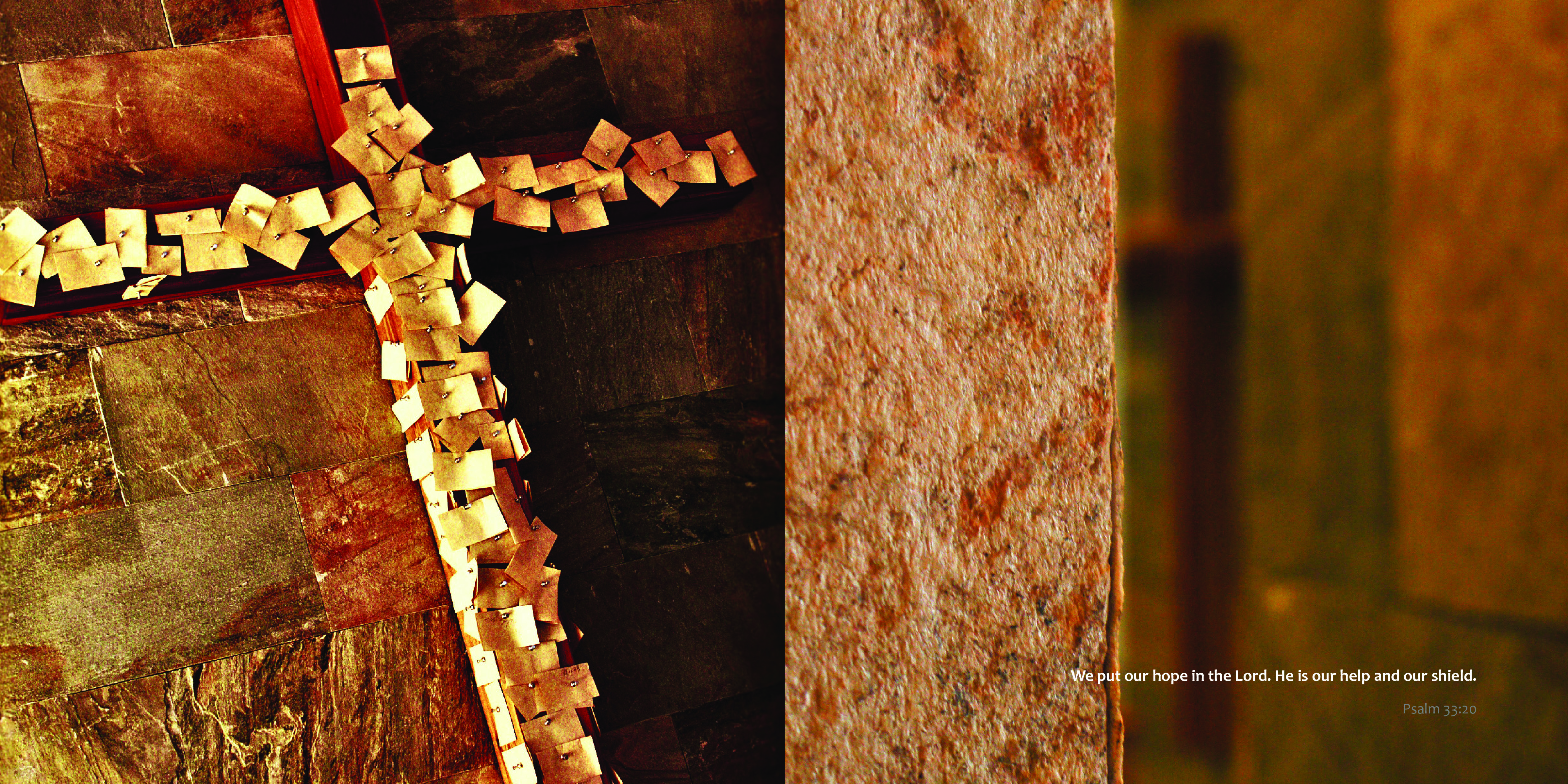
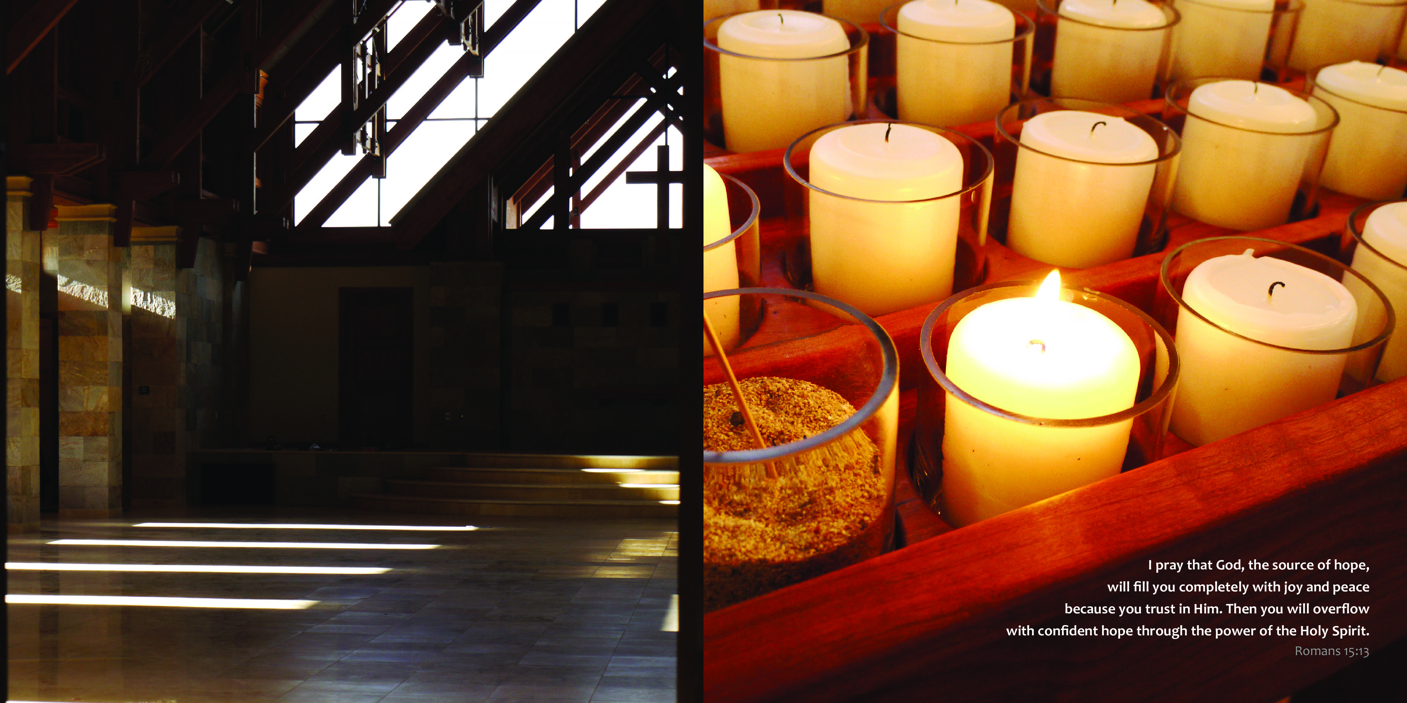
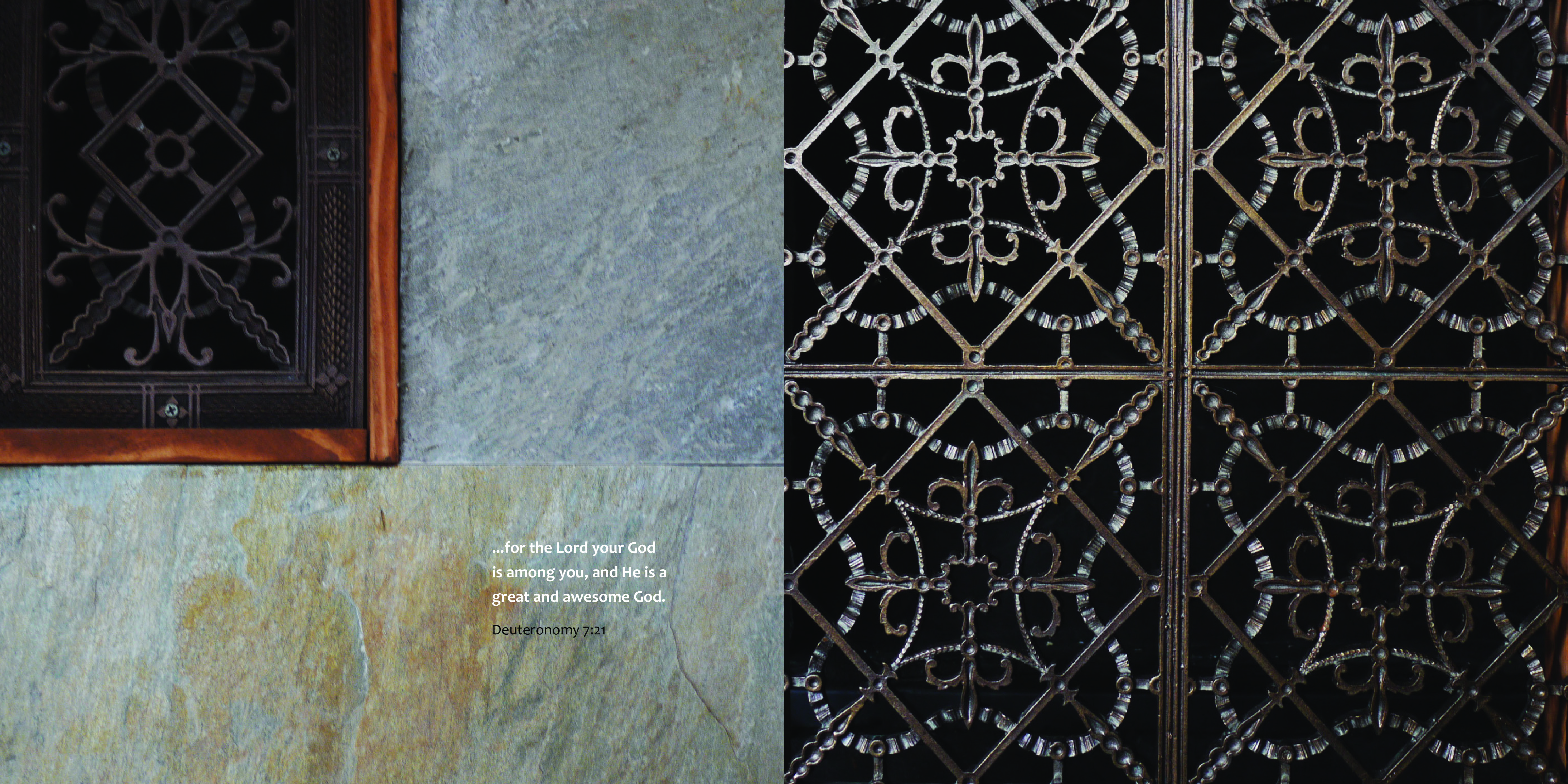
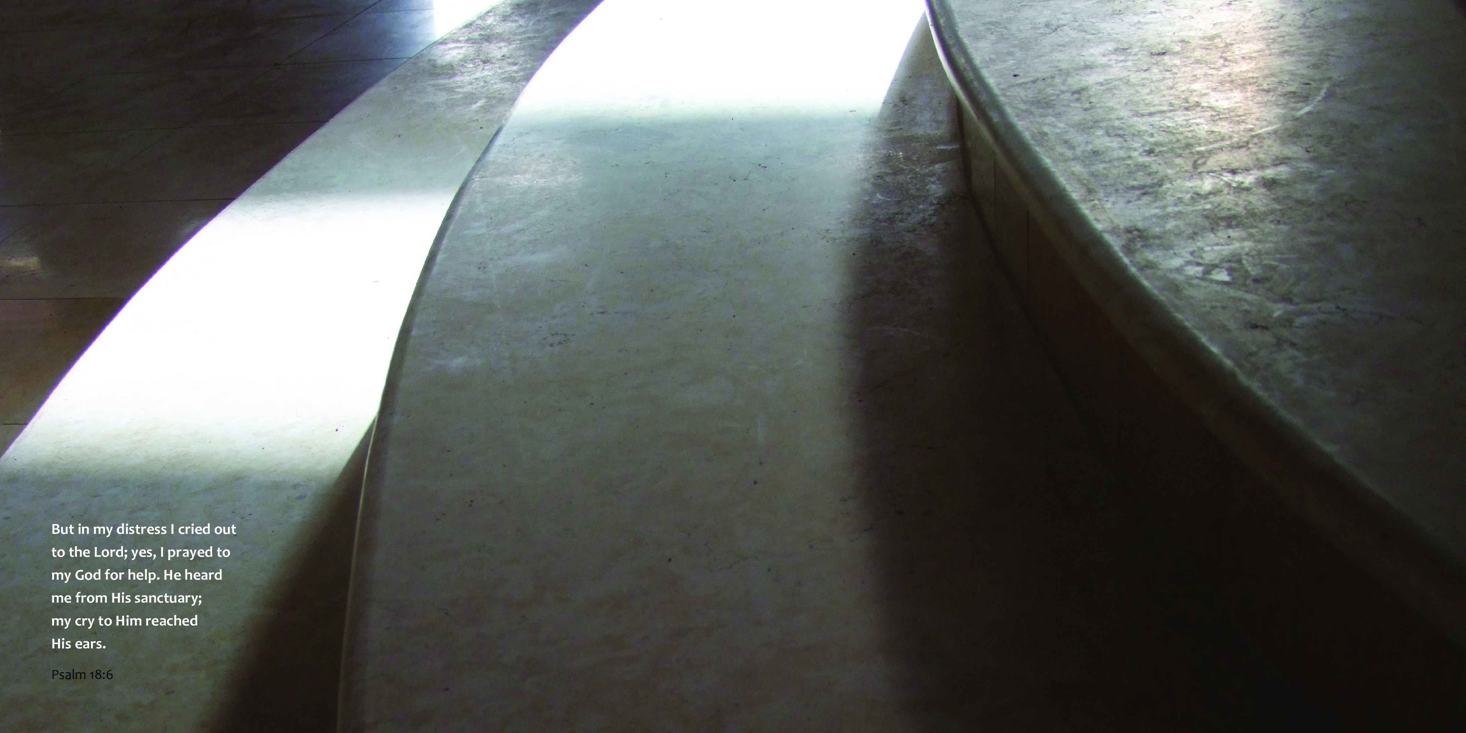
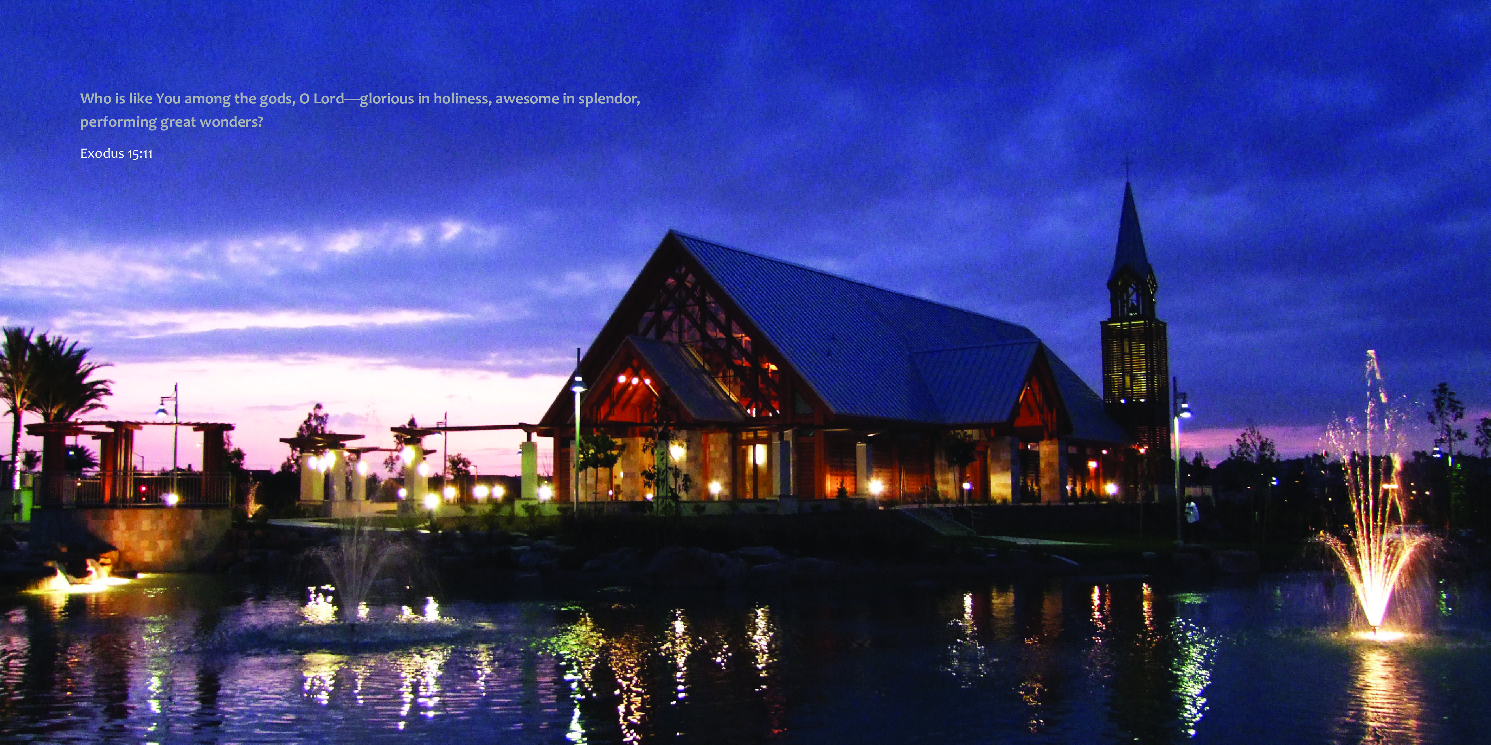
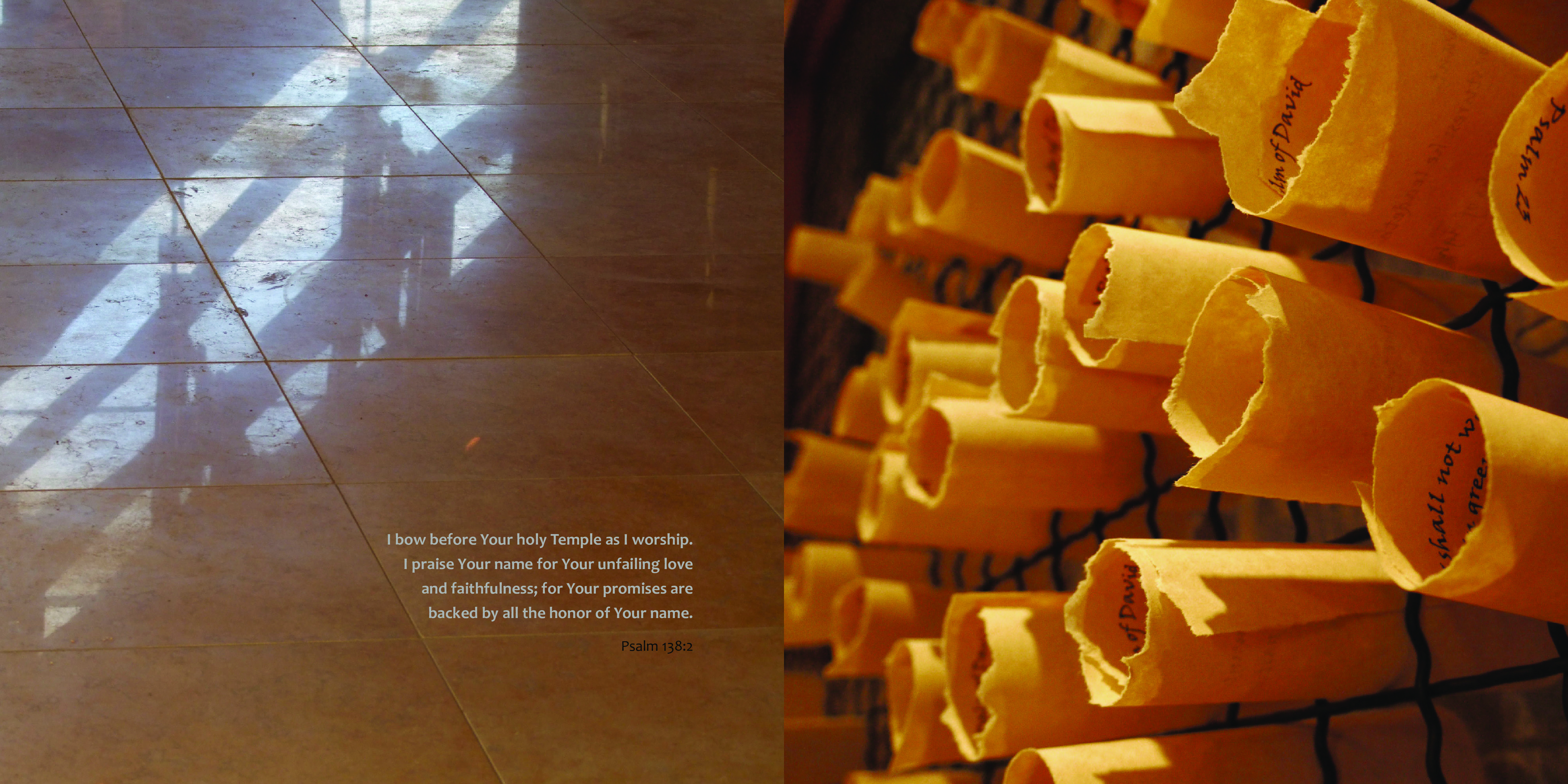
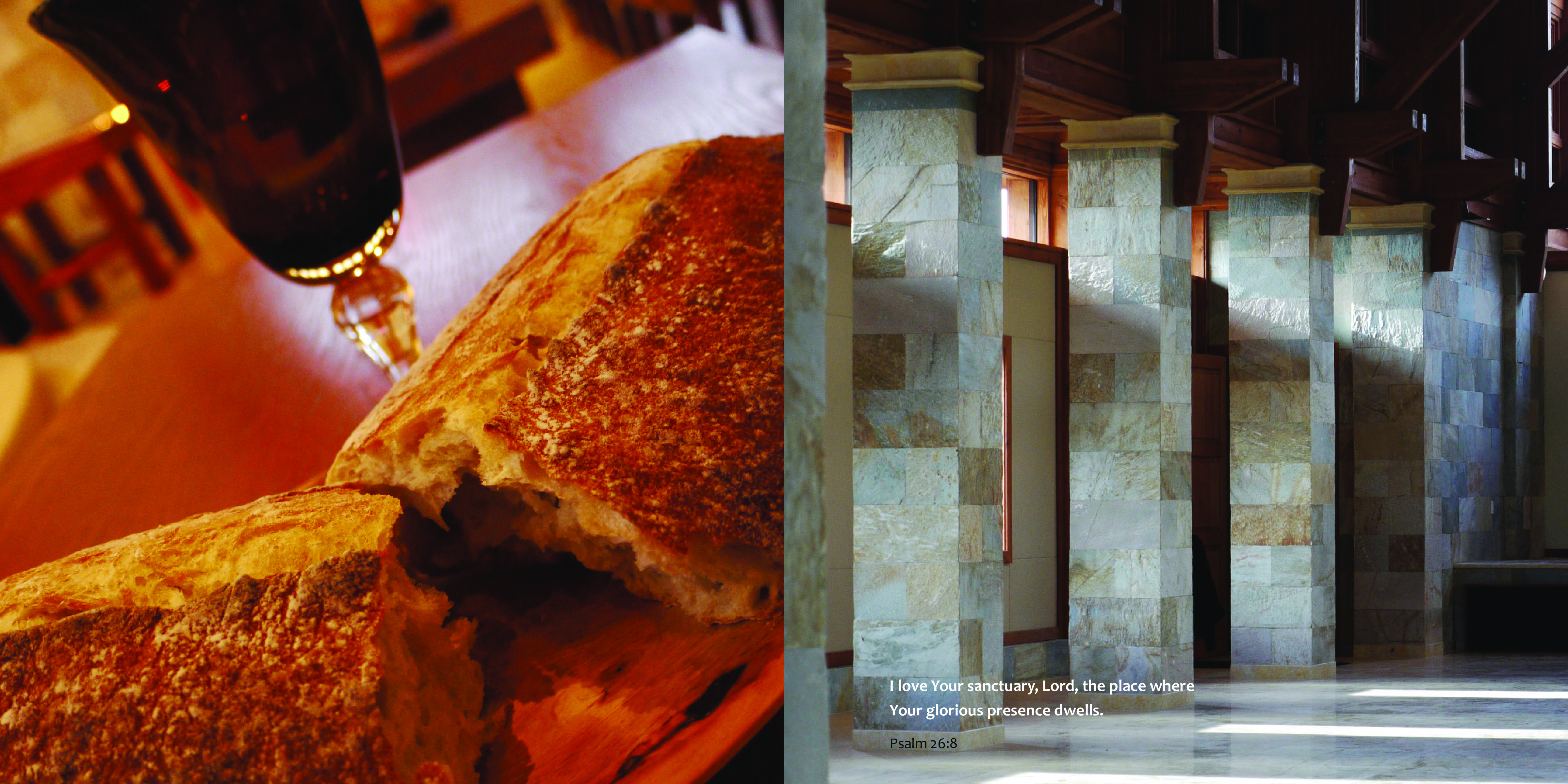
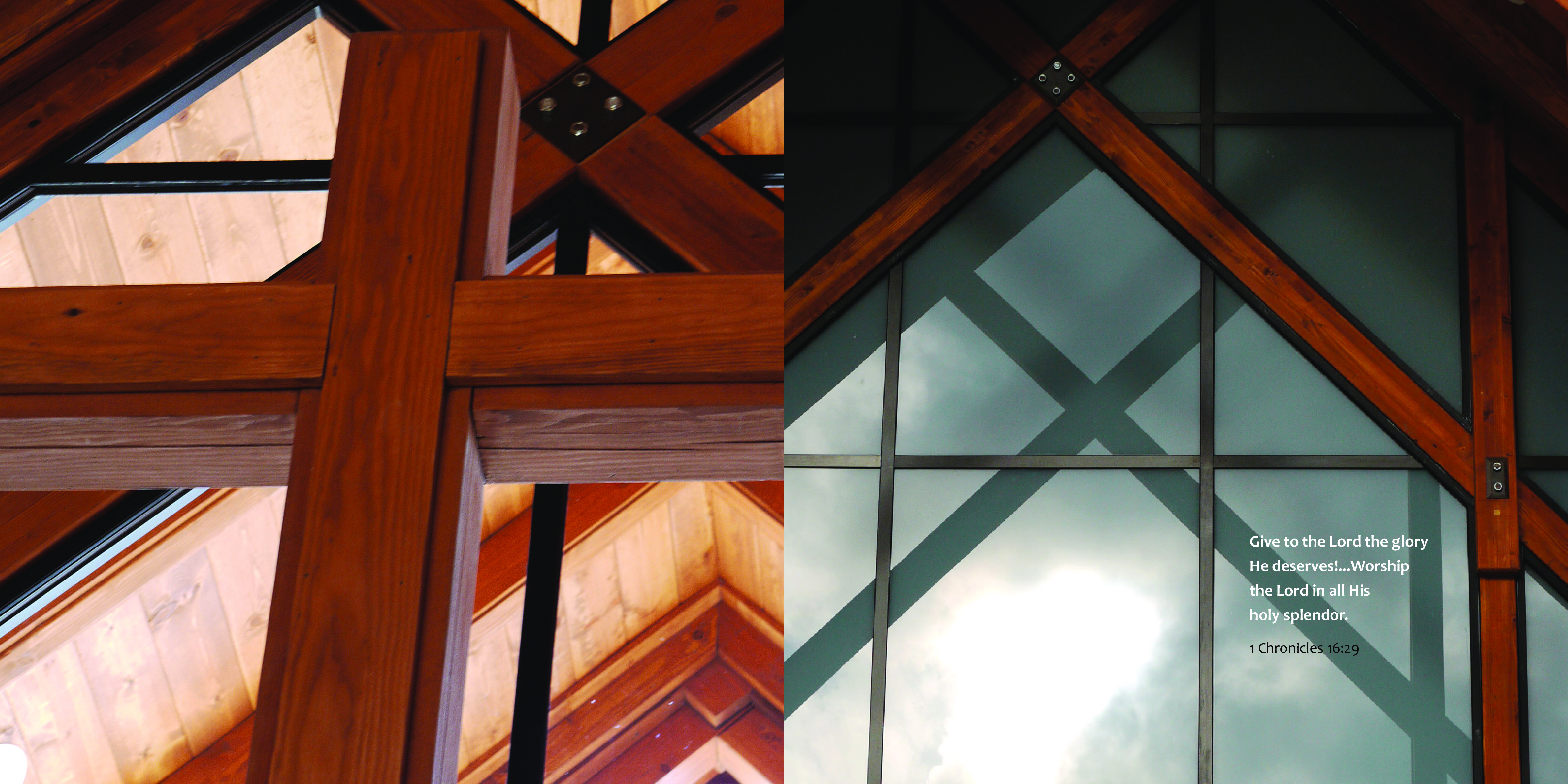
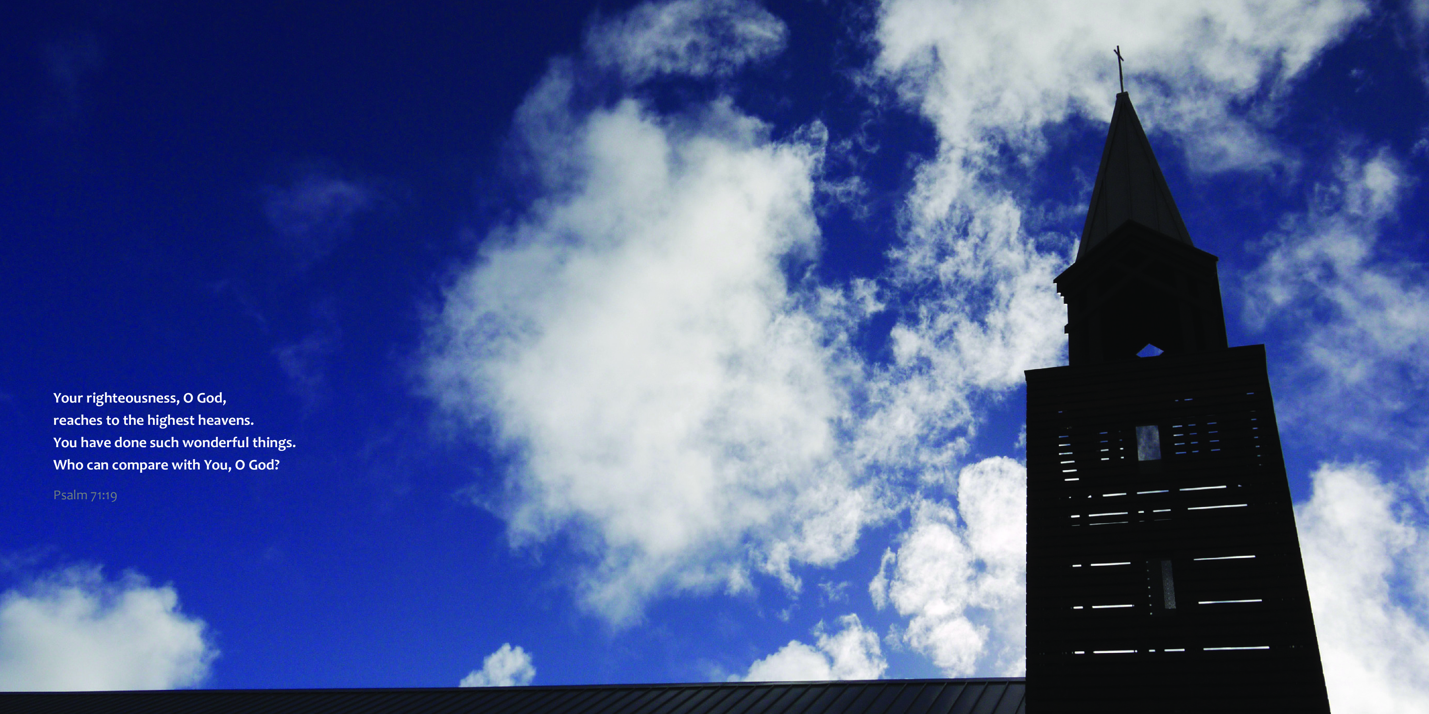
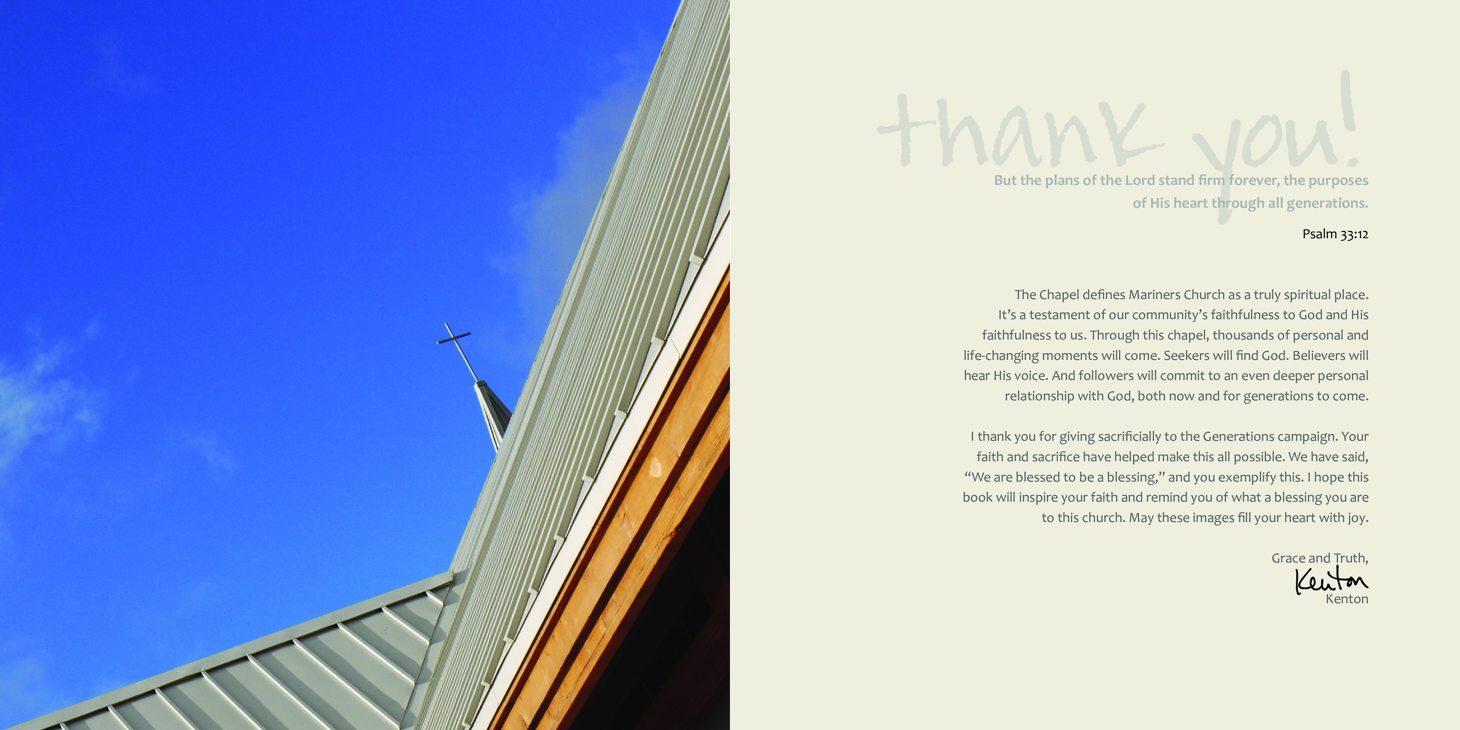
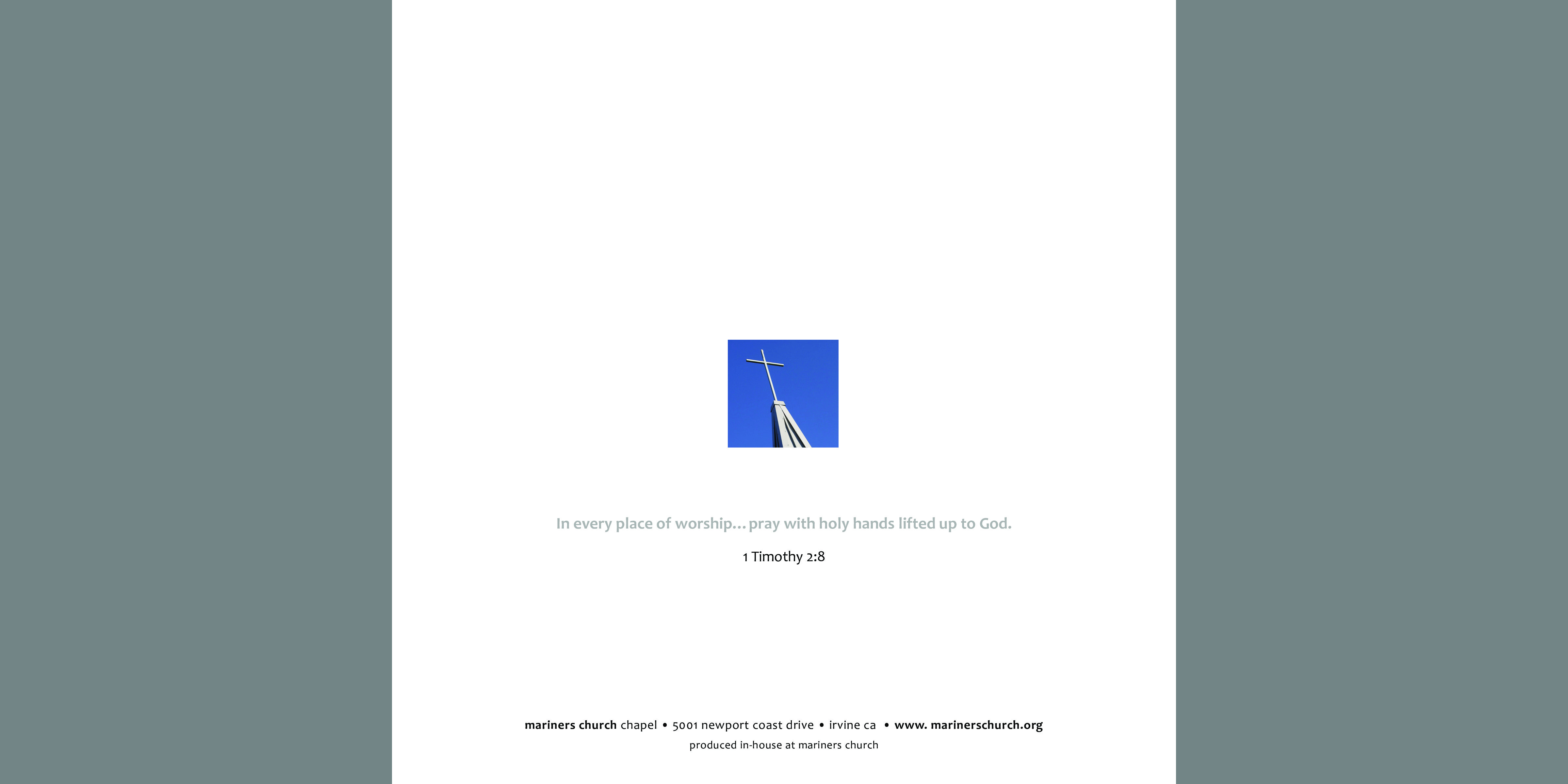
i designed and laid out this book of my photos taken during the construction of the Mariners Church Chapel. it was given as a thank-you gift for those who played a part in helping make the chapel possible. it was also produced and finished in-house using a Canon digital press, which allowed us to produce a short-run with incredible quality.
This Core Brand guide was prepared for Mariners Church and was designed to be communicate the highest level common values and to be used as a standard for each of the Mariners Church “churches” throughout Orange County, California.