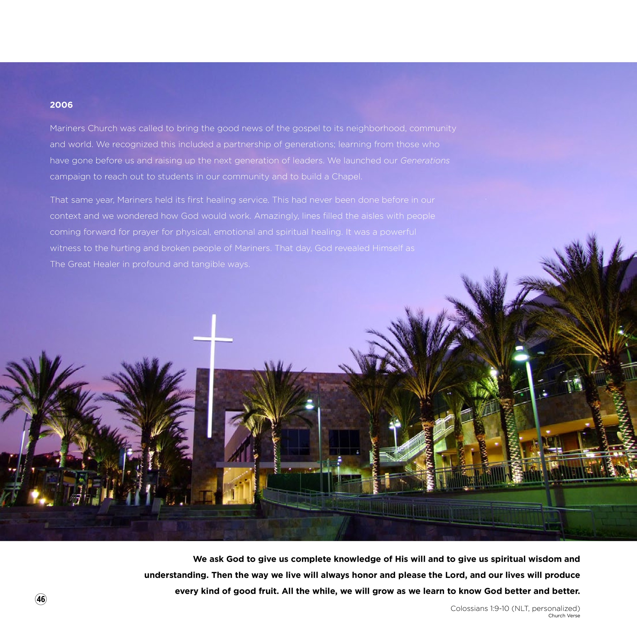
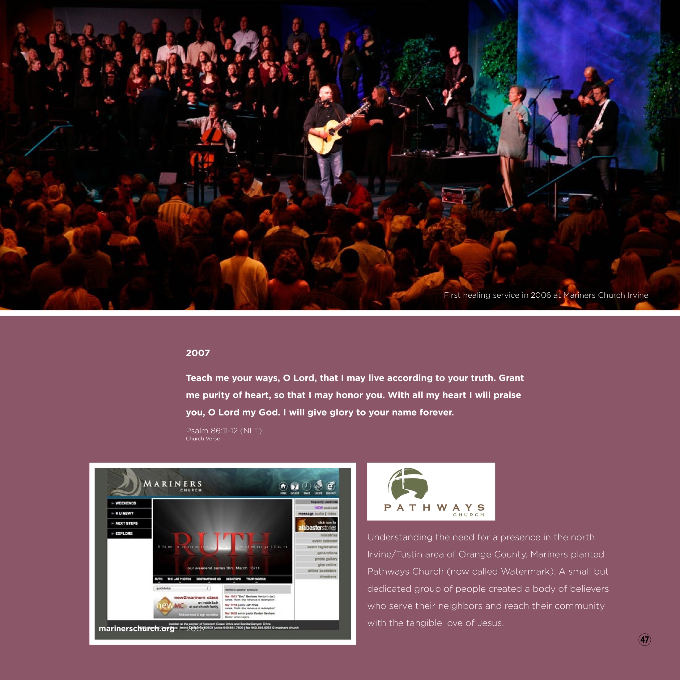
FROM AIRPLANES TO THE GRIFFIN . . .
By Mark J. McCourt from the February 2011 issue of Hemmings Sport & Exotic
Everyone knows that Saabs are “Born From Jets.”
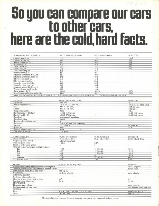
Or, at least, born from prop planes. Svenska Aeroplan Aktiebolaget’s first automotive product was the 1946 prototype, the “Ur SAAB” (original SAAB). Officially called 92001 and designed by noted industrial designer Sixten Sason (see Visionaries, HS&EC #40), this prototype was fitted with an impressive, if meaningless, heraldic emblem. The production 1950 Model 92 wore a nameplate logo of uppercase letters spelling SAAB in a rectangular housing, and this housing sat above silver “wings” that spread out to each side. Early cars featured one-piece silver castings, but a more appealing type followed with chrome wings and blue cloisonné surrounding the silver letters.
SAAB, as they were still known in this period, went back into their history in the early 1960s and designed a new logo with separate uppercase lettering and a stylized head-on view of a plane, with circles over the wings to denote spinning propellers. This dynamic identifier was seen on the grilles of 95 and 96 models, as well as early Sonett IIs. In the mid-1960s, the 95/96s used the lettering without the airplane. This design was further modified in the late 1960s, when the letters and airplane were combined into one small emblem, a blue trapezoid with rounded corners that was cast in plastic. This design was used on everything from 96s and Sonett IIIs to the upscale 99.
The Swedish automaker chose to modernize in 1974, dropping the vintage-style prop plane and tall, narrow lettering to focus on a stylized horizontal SAAB logotype with joined letters. This simple, stark emblem was used on the 99s, including the EMS and Turbo, and carried over to the early 900.
SAAB had merged with heavy truck manufacturer Scania-Vabis in 1969, forming the company Saab-Scania. It wasn’t until 1984 that the parentage of Saab automobiles made itself known on the cars; this was when the company’s new emblem, designed by Carl Fredrik Reuterswärd, debuted. Formed in a dark blue cloisonné circle, the words SAAB and SCANIA were shown in the outside and inside of a band that enclosed a red griffin wearing a gold crown. This mythical half-lion, half-eagle symbol actually came from the Scania division, which adopted it from the flag of its home area, the Skåne district of southern Sweden.
Saab cars wore this badge until model year 2000, when General Motors purchased the remaining 50 percent of Saab Automobile (GM bought 50 percent in 1990) and assuming full ownership. At this point, the Saab badge was redesigned, with the center ring and SCANIA reference disappearing; the enlarged griffin sat above the SAAB logotype. This design was freshened slightly in 2002 for a more three-dimensional appearance, and it remains on the hoods and wheel center caps of today’s Saab cars. The logotype has returned to prominence and is displayed proudly in the grille, on the steering wheel hub and in the rear lamp cluster of the 2010 and 2011 9-5 and 9-4X.